October 22, 2018
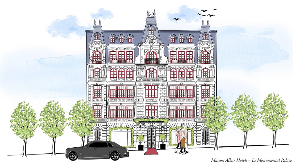
I’m very excited to share this collaborative work!
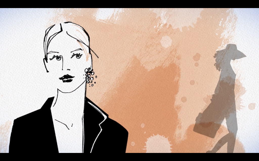
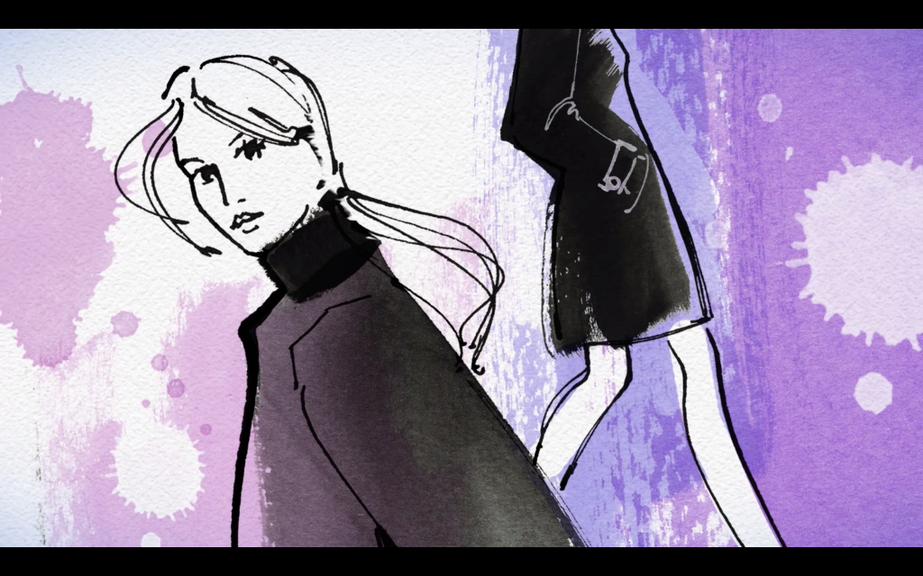
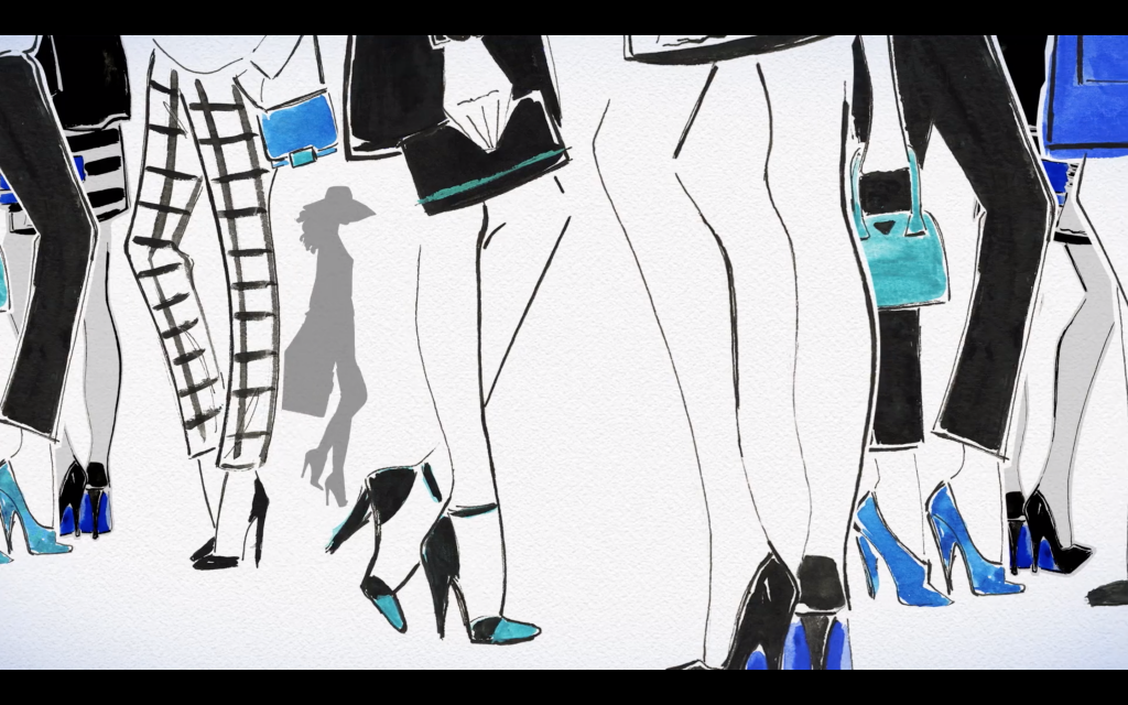
I recently partnered with talented animator Gary Mayes and combined our visual skills to produce this outstanding animation. (ahem, don’t judge me for my lack of humbleness… the video IS A-M-A-Z-I-N-G!)
We set off to work seamlessly together to produce this lovely and captivating piece
Watch the video HERE, and if you want to peek into our inspiration and working process, please read our interview for Illustration Web below.
Hi, could you tell us a bit about what your inspiration was behind the piece?
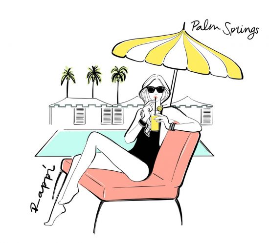
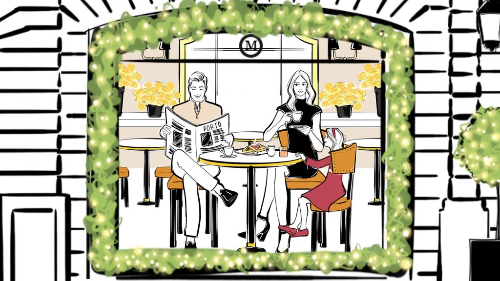
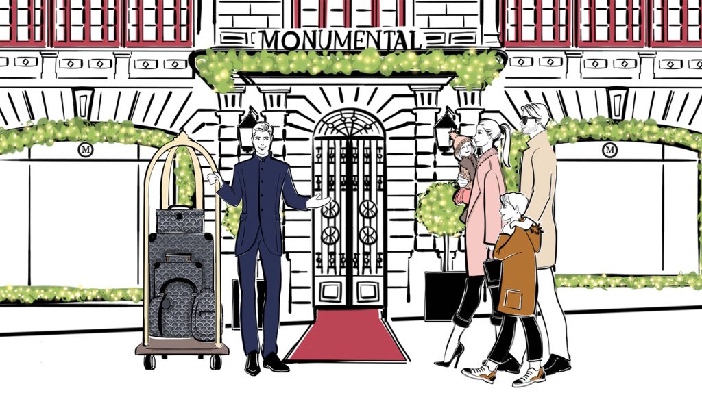
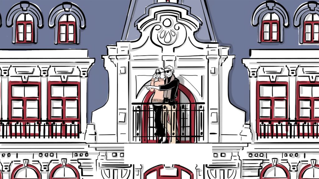
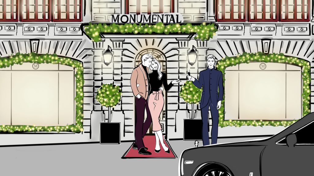
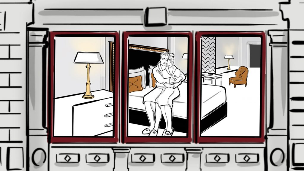
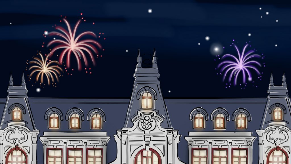
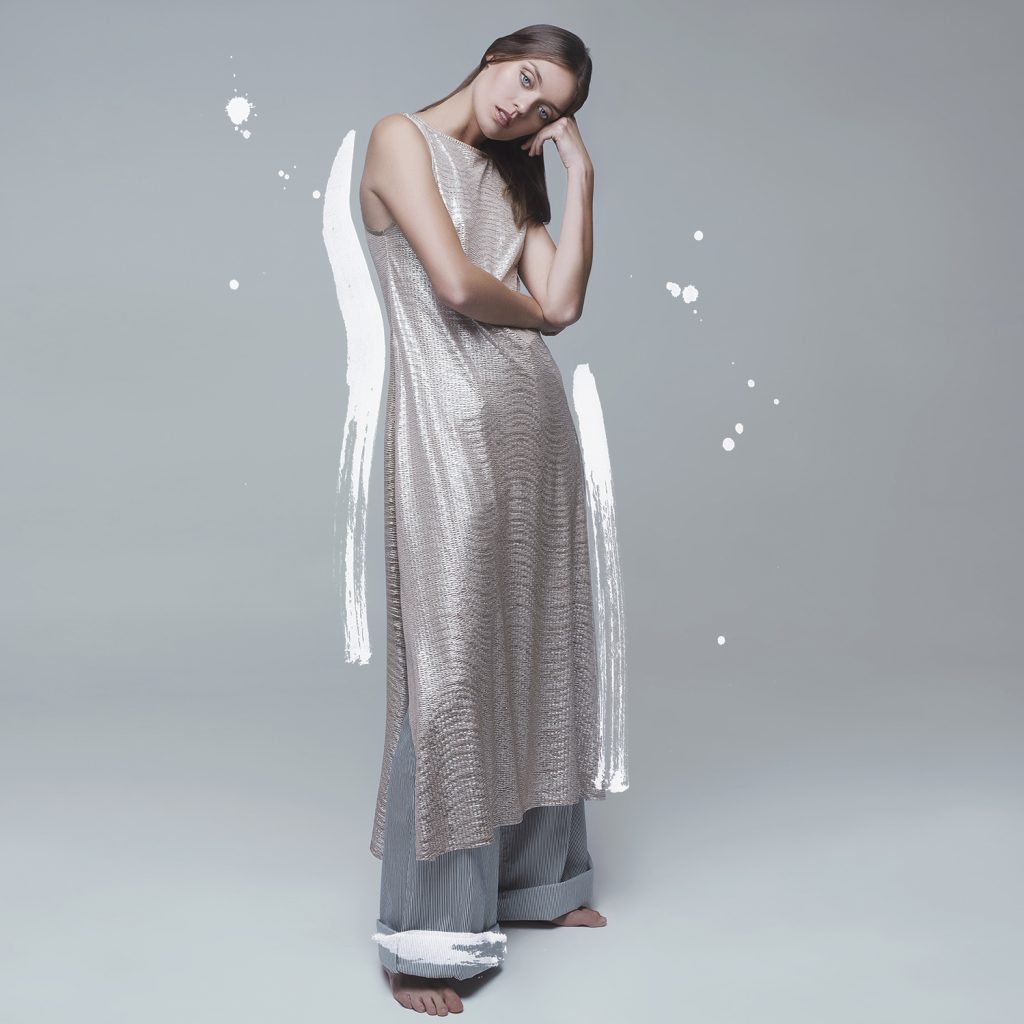
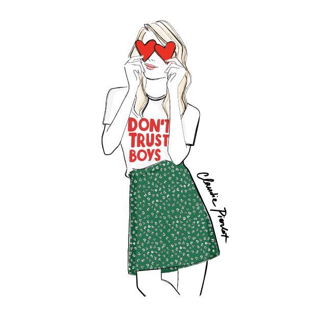
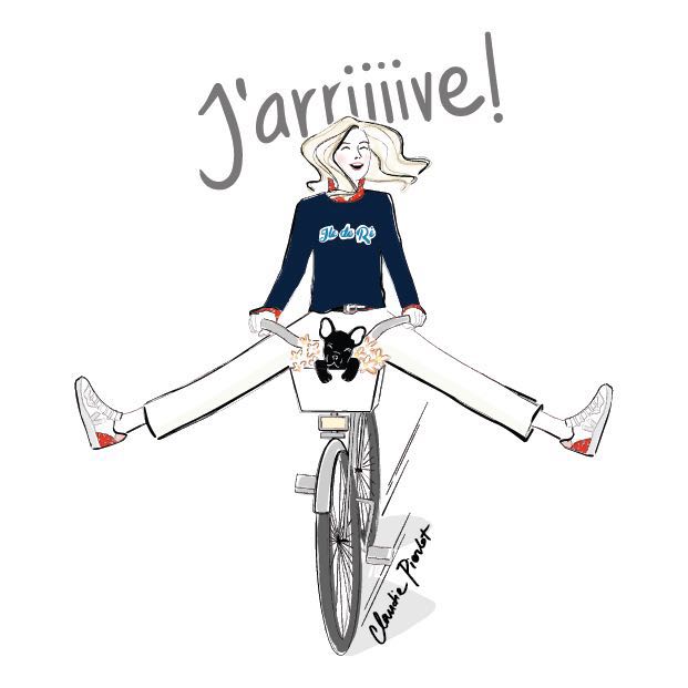
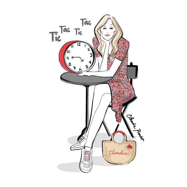
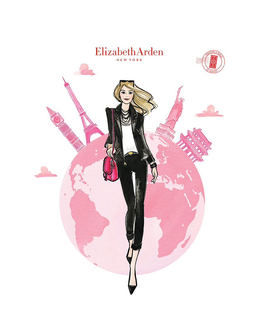
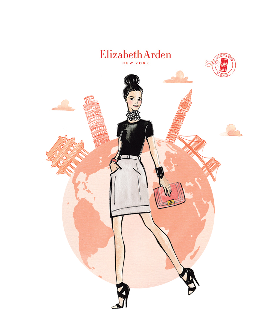
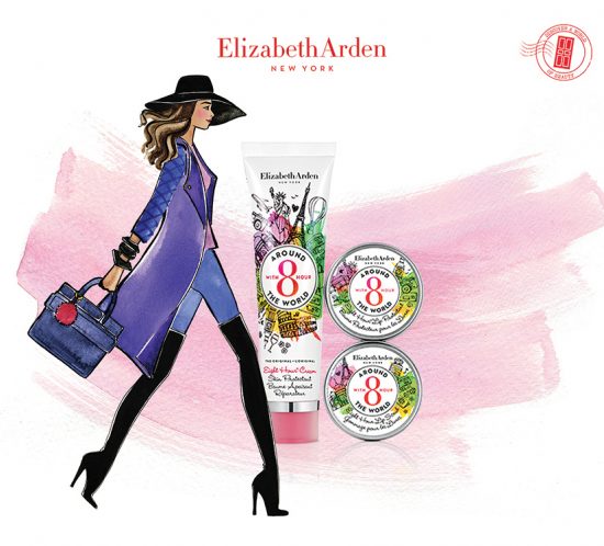
Gary: I was looking for an opportunity to showcase the potential of working with an illustrator’s work, something new and different that I hadn’t worked with before. ‘Fashion’ illustration seemed an obvious way to go, as the imagery is often very fluid, minimal in the mark making and inherently expressive. When looking through the range of Veronica’s work, I was struck by the variety, the quality of her line work and the loose splashes of colour.
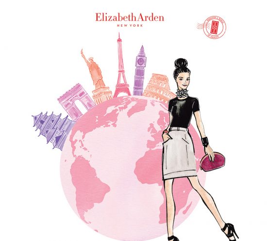
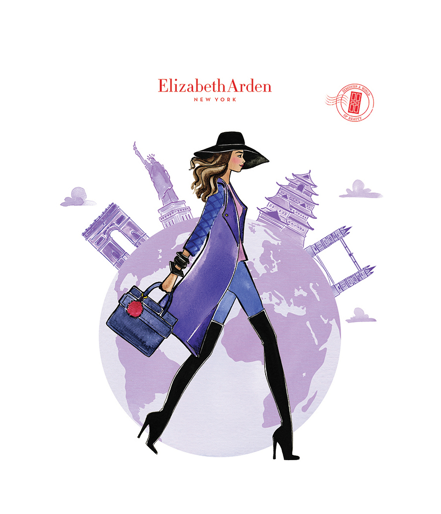
Veronica: We both wanted to create something to showcase our creativity and skill. I’m personally very moved when I see art in motion so I was very excited when Gary suggested we collaborated together. Each illustration has a story behind it but the common denominator are women, fashion and expression.

Tell us a bit about the theme?
Gary: When beginning to think about the theme of the piece, I created a storyboard of Veronica’s illustrations, to work out the sequence and composition of the images. I already had a few ideas about how her illustrations might lend themselves to animation, but hit on the idea of animating one figure as the link between the images and following her through the world of fashion and Veronica’s work.
Veronica: Gary would have a better idea of the story of the video itself but what I get from it is there’s a main character, a confident woman walking mysteriously and graciously through the video showing us the pieces, the art, the people, NYC, the world… taking us through her adventure.

What was the process of working with each other like?
Gary: Veronica and I chose pieces from her portfolio that we liked and felt would lend themselves to being animated. The first thing I always do is to start thinking about sound as it tends to be the emotional core of my work. For me, it was imperative that the music track provided the heart beat for this animation. I was looking for something dynamic and rhythmic that would reflect Veronica’s work and set the tone for the ‘walk’, as if on a runway fashion show. I sent her an edit of the music, and she thought it sounded ‘fabulous’ – so decision made! From then on, developing the animation was largely experimental, but driven by the storyboard. As Veronica’s images are immediate and expressive, I wanted imbue the animation with a sense of the images being drawn and painted rather than simply revealed.
Veronica: Gary and I discussed the pieces that will liked the most and would fit better in the story… We also discussed some ideas about how each piece could be animated and then he created his magic.
What kind of things did you discuss together?
Gary: We spoke about the notion of bringing a figure to life together with the pieces that might work well. At the time of conception, Veronica was working on a multi-layered piece and suggested how she thought that might be animated, truly collaborative thinking! It formed the basis the ending, with a little bit of artistic licence on how I worked it into the last sequence.
Veronica: What did we want to get from the collaboration, we exchange our top choices for the artwork and what could be done with each one, the type of music and the overall feeling of the piece.

Finally, what did you enjoy most about about working on this?
Gary: Above all else, working with Veronica and her illustrations as been a refreshing and a wonderful experience . Her work prompted me to think differently, experiment with technique and look for inspiration in the obvious qualities so easily found in her illustrations. She trusted me with her work and any ‘magic’ was already there, just waiting to find it’s way into animation. I’ve loved the sense of connection and the process of creating something unique that wouldn’t have been possible without collaborating with Veronica.
Veronica: It was super easy and smooth to work with Gary, he was kind and open to my ideas… he knew how to interpret my vision and execute it at a level of skill like no one I have worked with before. Professional, elegant, incredibly captivating… first class! I absolutely love the result.
Visit both Gary and Veronica’s portfolios to view their work.
We love collaborations and are on hand to curate the perfect team for your brief, bringing together your chosen Illustrator with an Animator to ‘make the magic happen’.
